
Measuring OEE and energy: where the time and the money actually go
Why the single figure hides what you need, how your own definitions change it, and why energy per unit produced is the measure that actually changes behaviour.
In short
- The single OEE figure is good for trends and useless for decisions. The components and reasons are where the value is.
- Definitions decide the number. What counts as planned time changes the figure without changing anything physical.
- Energy is the easiest place to start, measurable externally at the supply panel with no change to the process.
- Energy per unit produced is the metric that changes behaviour, because it connects consumption to output.
- These programmes fail for human reasons more often than technical ones.
Two questions most operations cannot answer precisely
Where did production time actually go last week, and which assets consumed the energy. Both are usually answered from the schedule, from memory, or from a spreadsheet maintained by somebody who has other work to do.
Measured answers are frequently different from assumed ones, and the difference is where the opportunity sits. The common experience when a plant first instruments properly is not discovering a single large problem but discovering that time is lost in many small increments nobody was counting, and that a substantial share of energy is consumed while nothing is being produced.
What OEE is, arithmetically
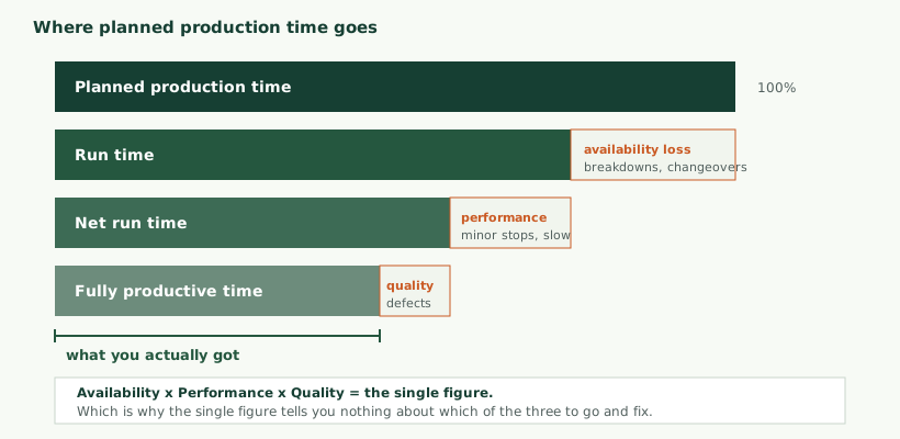
Overall Equipment Effectiveness combines three factors, each a ratio, multiplied together.
- Availability is run time divided by planned production time. It captures whether the machine was running when it was supposed to be.
- Performance is the time the output should have taken at the ideal rate, divided by the time it actually ran. It captures whether the machine ran as fast as it can.
- Quality is good output divided by total output. It captures whether what was produced was usable.
Why the single number is the least useful output
Consider two machines both reporting the same overall figure. The first is available almost all the time and runs at close to its rated speed, but produces a meaningful proportion of scrap. The second produces nothing defective and runs at full speed whenever it runs, but is stopped for a large fraction of the shift.
These are entirely different problems requiring entirely different responses. One is a process or tooling problem; the other is a reliability or changeover problem. The single figure treats them identically, which is why an organisation that reports only the headline number has measurement without direction.
Worse, the three factors can move in opposite directions and conceal each other. Running a machine slower often reduces defects, so performance falls while quality rises and the headline barely moves. Reading only the headline, you would conclude nothing had changed, when in fact a deliberate trade has been made.
The practical rule: report the three components separately, always, and treat the combined figure as a summary for trend rather than as a management target.
Definitions decide the number
This is the reason cross-company comparison is close to meaningless.
The denominator, planned production time, is a choice. Exclude breaks, planned maintenance, unscheduled shifts, and time waiting for materials, and availability rises sharply without anything physical changing. Two plants with identical machines running identical work can report figures many points apart purely through accounting.
The ideal cycle time used for performance is also a choice. Take it from the machine’s nameplate rating, and performance will look poor; take it from the best rate ever achieved with the current tooling and material, and it will look better. Neither is wrong; they measure different things.
What matters is picking a definition, writing it down, and applying it consistently. A figure that is comparable to itself over time is useful. A figure computed differently each quarter is worse than no figure, because it invites conclusions that the data does not support.
On published benchmarks. Figures describing what constitutes world-class performance circulate widely and are quoted with more confidence than their provenance supports. They depend entirely on definitions that are rarely stated. Comparing your number against them tells you very little, and can push an organisation into redefining its denominator rather than improving anything.
The losses, categorised
Breaking the three factors into the underlying loss types is what makes the measurement actionable.
| Loss | Affects | Typical causes | Usually detected by |
|---|---|---|---|
| Breakdowns | Availability | Component failure, jams, faults | Automatically, from run state |
| Changeovers and setup | Availability | Product changes, tooling, adjustment | Automatically, if the schedule is known |
| Minor stops | Performance | Misfeeds, sensor blockages, brief interventions | Often missed entirely without instrumentation |
| Reduced speed | Performance | Wear, material variation, deliberate derating | Cycle timing against the reference rate |
| Process defects | Quality | Drift, tooling wear, material | Inspection or downstream reporting |
| Startup rejects | Quality | Stabilisation after a start or changeover | Correlating rejects with recent starts |
Minor stops deserve particular attention because they are the losses most consistently invisible. A stoppage of thirty seconds, several times an hour, resolved by an operator without anyone recording it, does not appear in any downtime log and yet may account for more lost time than the breakdowns everybody discusses. Automated measurement finds these, and finding them is frequently the single largest result of instrumenting a line.
What to measure, practically
The measurements are covered in detail in our guide to retrofitting legacy machines, and the front-end considerations in sensor selection and signal conditioning. In summary:
- Run state from motor current, a cycle signal, or the controller where one is accessible.
- Cycle timing, which gives both count and rate, and whose distribution over a shift is often more revealing than its average.
- Counts of total and good output, which may come from the controller, from a sensor, or from downstream reporting.
- Reason codes for stoppages, which require a human input and are discussed below.
- Power at the supply, for the energy side.
Where a controller is accessible, taking data from it or from the supervisory system is usually easier than adding sensors; see SCADA and PLC integration. Where nothing is accessible, external current measurement gives run state and cycle timing without touching the machine.
Counting output reliably
Two of the three factors depend on counts, and counting turns out to be less straightforward than it sounds.
Where does the count come from? A controller may already maintain one, which is convenient and worth checking before adding sensors. Where it does not, a sensor at a suitable point in the process can count directly. Where neither is practical, cycle timing gives a count indirectly, on the assumption that each cycle produces one unit, which is true for some processes and not others.
What resets it, and when? A counter that resets at shift change, on power cycle, or when an operator presses something needs handling, otherwise you will record either enormous negative production or a spurious surge. Reading a cumulative counter and computing differences is more robust than reading a per-shift figure, provided you handle the point at which it wraps.
Where is quality determined? Frequently well downstream of the machine, sometimes hours later, sometimes at a final inspection covering several machines at once. Attributing a defect back to the machine that caused it may be straightforward or may be impossible, and where it is impossible the quality factor is an estimate rather than a measurement. Saying so is better than presenting it as precise.
What about rework? A unit that is defective, reworked and then sold is neither a good unit nor a scrapped one in any simple sense. Deciding how rework is counted is another definition choice that materially moves the number, and it should be recorded alongside the others.
Cycle time distribution beats cycle time average
The performance factor reduces a shift to a single ratio, and in doing so discards the most informative thing the data contains.
Consider two shifts with identical average cycle times. In the first, every cycle took almost exactly the average. In the second, most cycles were faster than the average and a minority took several times longer. These describe entirely different situations: the first is a machine running consistently, the second is a machine that is mostly fine and intermittently obstructed.
Looking at the distribution of cycle times rather than their mean exposes this immediately. A cluster of normal cycles with a tail of slow ones points at intermittent interference, material variation or minor stops. A distribution that has shifted as a whole points at wear, a setting change or a different material. A distribution with two distinct clusters usually means two different products or two different operating modes being reported as one.
This is one of the clearest arguments for capturing cycle-level data rather than shift summaries. The summary can always be computed from the detail; the detail cannot be recovered from the summary.
The reason code problem
Duration is measured automatically. Cause is not, and no amount of sensing infers it reliably. A machine that stopped does not know whether it stopped for a tool change, a material shortage, a fault, or a break.
So somebody has to say, and that interaction is where these systems succeed or fail.
The constraint is brutal and simple: if logging a reason takes a minute, it will not happen during a difficult shift, which is exactly when the data matters most. The result is a dataset in which good shifts are well documented and bad shifts are blank, which is worse than useless because it is systematically biased.
What works is making the interaction take seconds. A small number of large buttons on a screen near the machine. Reason codes chosen with the operators rather than for them, using the words they already use. A short list rather than a comprehensive hierarchy, because a taxonomy with forty options produces forty per cent “other”. Defaults that are correct most of the time. And the ability to correct an entry later rather than forcing a decision in the moment.
It is also worth accepting incomplete data gracefully. A system that demands a reason before the machine can restart will be defeated, usually by selecting whatever is quickest. Better to capture the stoppage with no reason than to corrupt the reason data.
Where OEE stops being the right tool
The measure was developed for discrete manufacturing, where a machine produces countable units at a repeatable rate. It transfers poorly to several other situations, and forcing it onto them produces figures that look authoritative and mean little.
- Continuous processes. Where output is measured by volume or weight rather than counted, cycle time has no meaning and the performance factor has to be redefined against throughput rate. That is workable but it is no longer the same measure.
- High-mix, low-volume work. Where every job is different, there is no stable reference rate to judge performance against, and changeovers dominate the picture. Measuring changeover time and utilisation directly is more informative than a composite figure.
- Machines that are not the constraint. Improving effectiveness on equipment that is not limiting output produces a better number and no additional production. Measuring everything and optimising the wrong asset is a recognised failure mode, and the response is to identify the constraint first.
- Manual and semi-manual operations. Where the pace is set by people rather than machines, the measure drifts uncomfortably close to measuring individuals, with the data-quality consequences discussed above.
In these situations the underlying measurements are still valuable. Run state, cycle timing, downtime reasons and energy all remain informative. What changes is that combining them into a single effectiveness ratio adds confusion rather than clarity, and reporting the components directly serves better.
The general principle worth holding: measure what you will act on. A composite indicator that nobody can trace back to an action is overhead, however widely it is used elsewhere.
Energy, which is often the easier place to begin
Energy has a practical advantage: it can be measured entirely externally, with current measurement at the supply panel, requiring no cooperation from the machine and no change to the process. For an organisation that wants a result before committing to a wider programme, it is frequently the fastest route to one.
What makes it useful is not the total, which the utility bill already provides, but the breakdown.
- Per asset. Which machines consume what, which is frequently a surprise and immediately directs attention.
- Per shift and per product. Consumption varies with what is being made and who is running it, and both are actionable.
- Per unit produced. The metric that changes behaviour, discussed below.
- Standby and idle draw. What equipment consumes while producing nothing.
Measuring energy in practice
The measurement itself is straightforward but there are choices that affect what the numbers mean.
Current alone, or real power? Measuring current is simplest, requires only a clamp, and is adequate for comparing an asset against itself over time. It is not the same as power, because it takes no account of the phase relationship with voltage, and in a plant full of motors and drives that difference is substantial. If you need consumption in energy units, or to reconcile against a utility bill, voltage measurement is needed too, which adds an isolation requirement and a more involved installation.
A pragmatic arrangement is current-only on individual assets for relative comparison and trend, with proper power measurement at the distribution level where absolute figures matter.
Where to measure. At the supply to each asset gives the most useful attribution. At a distribution board gives a group total more cheaply, which may be enough to identify where to look more closely. Starting at board level and instrumenting individual assets afterwards, guided by what the board-level data shows, is often the most efficient sequence.
Sampling rate. Motors and drives draw current that is far from a clean sinusoid, and an instrument that assumes one will misreport. Startup surges are also brief and large, and a slow measurement will miss them entirely while they are exactly what a supply assessment needs. Matching the measurement to the signal is the same discipline described in sensor selection and signal conditioning.
What to record. Consumption accumulated over intervals is compact and sufficient for most reporting. Retaining a faster record around startups and around anomalies gives you the detail when something needs investigating, without storing everything at high resolution indefinitely.
Energy per unit produced
Total consumption tells you little, because it rises with output and a busy month looks worse than a quiet one. Dividing by units produced connects consumption to value, and the resulting measure behaves usefully: it rises when equipment degrades, when a process drifts, and when machines run without producing.
It also reframes the conversation. Total energy is a cost to be minimised, which conflicts with producing more. Energy per unit is an efficiency to be improved, which does not. That distinction matters for whether an operations team engages with the programme or resists it.
Idle and standby consumption
Equipment drawing power while producing nothing is one of the most commonly found and most easily addressed opportunities. Machines left running between shifts, auxiliary systems that never switch off, heating maintained on equipment nobody is using, extraction running in empty areas.
None of this is visible without measurement, and much of it can be addressed with scheduling rather than capital expenditure, which makes it unusually attractive as a first result.
Energy reporting obligations
A growing number of organisations now have to report energy consumption or emissions, either through regulation, through customer requirements in their supply chain, or through commitments they have made publicly. Where that applies, per-asset measurement stops being purely an efficiency exercise and becomes a data source for reporting.
That changes a few requirements. Retention becomes longer, because reporting periods are annual and questions may be asked afterwards. Traceability matters more, since a figure that appears in a report should be explicable back to a measurement and a method. And the boundary of what is measured needs defining and holding steady, because a consumption figure that improves because the measurement scope changed is a problem rather than an achievement.
Which obligations apply depends on your size, sector and markets, and they have been changing. Establish this with whoever handles your reporting rather than assuming, but if any apply it is worth knowing before designing the measurement, because retrofitting traceability onto a system built for operational use alone is awkward.
Compressed air
Worth singling out, because it is generated on site and its losses are invisible.
Compressed air is an expensive utility to produce, and leaks in distribution are continuous, silent at audible frequencies, and cumulative. A system that has not been surveyed for some years frequently loses a substantial proportion of what it generates, and because the compressor simply runs more to compensate, nothing appears wrong.
Measuring compressor load and run cycles reveals the scale of the problem, and ultrasonic leak surveys locate it. This combination is one of the more reliable early wins available in plants using compressed air, and it needs no change to production.
What the data reveals that nobody expected
Across this kind of work, a few findings recur often enough to be worth anticipating, because knowing they are likely helps in designing the measurement to catch them.
Minor stops dominate. Brief stoppages nobody logs frequently account for more lost time than the breakdowns that get discussed in meetings. They are invisible without automated measurement because each individually feels trivial.
The constraint is not where people think. Operations often have a firm belief about which machine limits output. Measurement regularly locates it elsewhere, sometimes in a step that was never considered a bottleneck because it is rarely stopped but is consistently slow.
Changeover time varies enormously. The same changeover performed by different people, or on different shifts, can take substantially different times. That variation is usually a procedural and preparation question rather than a skill question, and it is frequently the largest single availability opportunity.
Standard rates are wrong. The ideal cycle time in the planning system is often historical, set for a different tooling generation or a different material, and neither the best achievable nor a fair target. Measurement gives you the real distribution, which is a better basis for planning than a number nobody can trace.
Energy continues outside production. Consumption overnight and at weekends is almost always higher than expected, and much of it is addressable through scheduling rather than investment.
Product mix explains more than anything else. Variation that looks like a performance problem frequently turns out to correlate with what was being made, which means the data needs product context to be interpretable at all.
That last point has a design implication: capture what was running alongside how it ran. Without product, shift and operating mode recorded next to the timing data, a great deal of apparent variation cannot be explained and the analysis stalls.
Presenting it to people who can act
Different audiences need different views, and giving everyone the same dashboard serves none of them.
| Audience | Needs to see | Where | Timescale |
|---|---|---|---|
| Operators | Current state, rate against target, what to log | At the machine | Now |
| Supervisors | Which line is behind, why, what is stopped | On the floor | This shift |
| Engineering | Patterns, recurring stops, cycle drift | Desktop | Weeks |
| Management | Trends, comparisons, where to invest | Report | Months |
The floor display is the one most often neglected and the one that changes behaviour fastest, because it is the only view that reaches people while they can still affect the shift. It should show very little: state, rate against expectation, and any action required. A dashboard designed for an office, displayed on the floor, is ignored within a week.
The part that determines whether it survives
These programmes fail for human reasons far more often than technical ones, and the decisive question is what the numbers are used for.
If measurement is used to judge operators, data quality collapses immediately and permanently. Reason codes become whatever attracts least attention, stoppages go unlogged, and the dataset becomes an account of what people thought was safe to record. No amount of engineering recovers from this.
Programmes that survive are explicit from the start that the target is the process, and they demonstrate it by acting on what the data reveals about constraints, tooling, materials and scheduling rather than about individuals. The fastest way to establish that credibility is to fix something the operators have been complaining about, using the data as evidence. After that, they will help you.
Getting from measurement to improvement
Instrumenting a line produces data. Turning that into improvement is a separate activity, and programmes that stop at the dashboard are common.
What works is a short, regular review with the people who can change things, looking at a small number of questions rather than the whole dataset.
- Which loss category was largest this period? Not the overall figure, but which of availability, performance or quality gave up the most, and within it which specific loss.
- What is the most frequent stoppage reason? Frequency and total duration are different rankings, and both are worth seeing. A frequent brief stoppage may cost more than a rare long one, and is usually easier to address.
- What changed since last time? Movement is more informative than level, and a factor that has drifted quietly over weeks is easy to miss when looking only at the current number.
- What did we try, and did it work? Closing the loop on the previous period’s action is what converts a reporting meeting into an improvement process.
Keeping that review short and specific matters more than its sophistication. A twenty-minute weekly conversation that ends with one agreed action outperforms a monthly review of forty charts that ends with everybody agreeing the numbers are interesting.
Choosing what to fix first
The data will show more opportunities than there is capacity to pursue, and the ranking is not obvious. Total time lost is the natural first sort, but it is worth weighing against how difficult each is to address. A large loss requiring capital investment and a production stoppage may be a worse first project than a smaller one fixable with a procedural change, because the second builds credibility and the first consumes it.
Early in a programme, choosing a visible problem that the operators themselves have been complaining about is frequently the best strategy, regardless of its ranking by duration. It demonstrates that measurement leads to action, which is what determines whether the reason codes keep being entered.
A worked example
A line of six machines, no existing measurement beyond a production count recorded at the end of each shift.
Begin with current measurement on all six, giving run state, cycle timing and load without touching any machine. Add a simple floor terminal for reason codes with six options agreed with the operators. Take the good and total counts from the existing end-of-line inspection rather than building new quality measurement. Add power measurement at the panel for the energy side.
Collect for a defined period before drawing conclusions, covering the products and shifts normally run. Then look at the three factors separately, at the distribution of cycle times rather than their average, at the frequency of short stops, and at energy per unit across shifts and products.
The results most likely to appear: more minor stops than anyone expected, cycle time varying more by product than the standard rates suggest, and a meaningful fraction of energy consumed outside production hours. Each points at a different intervention, and none would have been visible from the shift report.
Building the case for instrumenting a line
The business case here is usually easier than for condition monitoring, because the losses are continuous rather than occasional, and because some of them can be estimated from what you already know.
A workable starting position: take the difference between what a line is scheduled to produce and what it actually produced over a recent period, and express it in whatever unit the business uses. That gap is the size of the opportunity, before anybody knows what causes it. You do not need instrumentation to establish that the gap exists, only to find out where it went.
Then propose finding out, on one line, for a defined period, at a known cost, with agreed criteria for what would justify extending. The criteria are worth specifying carefully: not “improve output”, which depends on acting on the findings, but “identify where the gap is, in enough detail to act on”. That is something a measurement project can be held to.
What makes this case stronger than most is that the first findings are usually surprising, and surprising findings tend to sustain support. Discovering that a line loses more time to brief unlogged stoppages than to the breakdown everybody talks about changes the conversation, and it is the kind of result that appears within weeks rather than years.
What it costs, roughly
Without seeing an installation we will not quote figures, but it is worth knowing how the cost distributes, because it differs from expectations.
Sensing hardware is usually a small share, particularly where current measurement covers run state and cycle timing without additional sensors. Installation, including qualified panel work and any production access required, is larger and varies most with site conditions. The floor interface for reason codes is a modest piece of software with an outsized effect on whether the programme works. Integration with existing systems is the least predictable element, as it is in any plant data project. And the analysis and review process is ongoing rather than capital, which is the part that tends to be omitted from budgets and is what determines whether the measurement produces anything.
Mistakes worth avoiding
- Reporting only the combined figure. It hides which of three problems you have.
- Changing the definition to improve the number. It improves nothing and destroys comparability.
- A reason code taxonomy with too many options. Produces a large “other” category and little else.
- Making reason entry slow or mandatory. It will be defeated, and the data corrupted rather than missing.
- Office dashboards on the floor. Wrong content, wrong timescale, ignored.
- Measuring total energy only. Rises with output; tells you nothing about efficiency.
- Benchmarking against published figures. Different definitions, no comparability.
- Using the data to assess individuals. The fastest way to end a programme.
How we help
- Scoping. Which assets to instrument, based on what their downtime and consumption actually cost.
- Measurement design. What to sense and how, from the controller or externally.
- Retrofit installation. External sensing on equipment offering no interface. See legacy machine retrofit.
- Reason capture. A floor interface fast enough to be used under pressure.
- Dashboards and reporting. Separate views for floor, supervision and management. See cloud and dashboards.
- Integration. Into MES, ERP or maintenance systems where the numbers must join existing reporting, which is covered in OT/IT integration.
- Definitions. Documented calculations, so the figures can be trusted and questioned.
The service page for this work is OEE and energy monitoring. Where the aim extends to predicting equipment failure, see predictive maintenance.
Scaling beyond the first line
A pilot on one line is a different proposition from a site-wide system, and the problems that appear on scaling are predictable.
Definitions have to be shared. Two lines computing availability differently cannot be compared, and somebody will compare them anyway. Agreeing the definitions centrally, before the second installation, avoids a reconciliation exercise later.
Reason codes have to be common enough. Every area will want its own vocabulary, and some of that is legitimate because processes genuinely differ. A workable compromise is a shared set of top-level categories with area-specific detail beneath, so that site-level reporting is possible while the floor sees words it recognises.
Configuration effort grows. Setting up one line by hand is fine; setting up forty is a project in itself. Tooling that lets a new asset be configured from a template, rather than from scratch, is what makes a site-wide rollout sustainable.
Somebody has to own it. Thresholds drift, sensors fail, product codes change, and new equipment arrives. A system with no owner degrades quietly and is abandoned within a year or two, usually after the person who championed it moves on.
Comparison between areas needs care. Different processes have genuinely different achievable figures, and ranking areas against each other by a single number produces defensiveness rather than improvement. Each area’s trend against itself is the comparison that generates useful conversations.
A short glossary
| Term | Meaning |
|---|---|
| Availability | Run time as a proportion of planned production time. |
| Performance | How close actual output rate came to the reference rate while running. |
| Quality | Good output as a proportion of total output. |
| Planned production time | The time you intended to produce. A definition choice, and the one that moves the figure most. |
| Ideal cycle time | The reference rate used to judge performance. Another definition choice. |
| Minor stop | A brief stoppage resolved without maintenance, usually unlogged and collectively significant. |
| Changeover | Time spent switching between products, including setup and first-off approval. |
| TEEP | Effectiveness measured against all calendar time rather than planned time. A capacity measure. |
| Reason code | The category recorded against a stoppage, supplied by a person rather than inferred. |
| Specific energy | Energy consumed per unit produced. The measure that connects consumption to value. |
| Standby draw | Consumption while equipment is powered but not producing. |
If you take one thing away
The number is not the point. Organisations that treat the headline figure as the objective end up managing the definition rather than the process, and the figure improves while nothing physical changes.
What produces improvement is the detail underneath: which loss category dominates, which stoppages recur, how cycle time is distributed rather than averaged, and how much energy is consumed while nothing is being made. All of that requires measurement at a finer grain than a shift report, and a review process that turns it into one agreed action at a time.
And it requires the people on the floor to keep supplying the one thing no sensor provides, which is why the reason a machine stopped is the most valuable and most fragile field in the whole dataset. For how a measurement reaches the people who act on it, see what industrial IoT actually is.
Questions we are asked about this
What clients ask before starting
Is a single OEE number useful?
For tracking a trend, yes. For deciding what to fix, very little, because three quite different problems produce the same figure. A machine stopped half the time and one running constantly at half rate can report identically. The value is in the components and in the reasons behind them.
What counts as planned production time?
Whatever you decide, which is precisely why comparisons between organisations are unreliable. Excluding breaks, planned maintenance and unscheduled shifts raises the figure without changing anything physical. Pick a definition, write it down, and keep it consistent.
Can we measure energy without modifying machines?
Usually yes. Current measurement at the supply panel requires no electrical modification and no change to the process, which makes energy one of the easiest places to start. Work inside a panel still needs a qualified person under your site rules.
How do you capture the reason a machine stopped?
Duration is measured automatically; the reason usually needs a short operator input. The design question that decides whether it works is how few seconds that interaction takes, because a slow interface will not be used during exactly the shifts when the data matters most.
Should we compare our figures to industry benchmarks?
With considerable caution. Published figures depend entirely on what was counted as planned time and what was excluded, so they are rarely comparable. Your own trend against your own consistent definition is worth far more.
What improvement can we expect?
We will not quote a figure before seeing your operation, because numbers of that kind are marketing rather than engineering. We agree measurable criteria for a pilot and report against them honestly, including where the data showed less opportunity than hoped.
What is the difference between OEE and TEEP?
OEE measures against the time you planned to produce. TEEP measures against all available time, including shifts you chose not to run. TEEP is the more honest measure of capacity, and it is usually a much smaller number, which is why it is less popular.
Will operators resist being measured?
If the numbers are used to judge them, yes, and data quality collapses with it. Programmes that survive are explicit that measurement is aimed at the process, and they demonstrate it by acting on the constraints the data reveals rather than on individuals.
What would you measure first?
Tell us what the equipment is, whether you currently track downtime or energy at all, and what decision you would make differently if you had the numbers.